
Traders constantly describe stocks as “overextended,” but very few ever stop to define what that actually means. And while there may never be a single universal definition, effective trading demands precision. Overextension is no exception.
If you’re serious about capitulation trading — or any strategy that relies on identifying exhaustion — developing your own clear definition of overextension is some of the most important work you can do.
In this piece, we’ll walk through the core metrics I use to evaluate just how stretched a stock really is.
1. Distance From the Moving Average
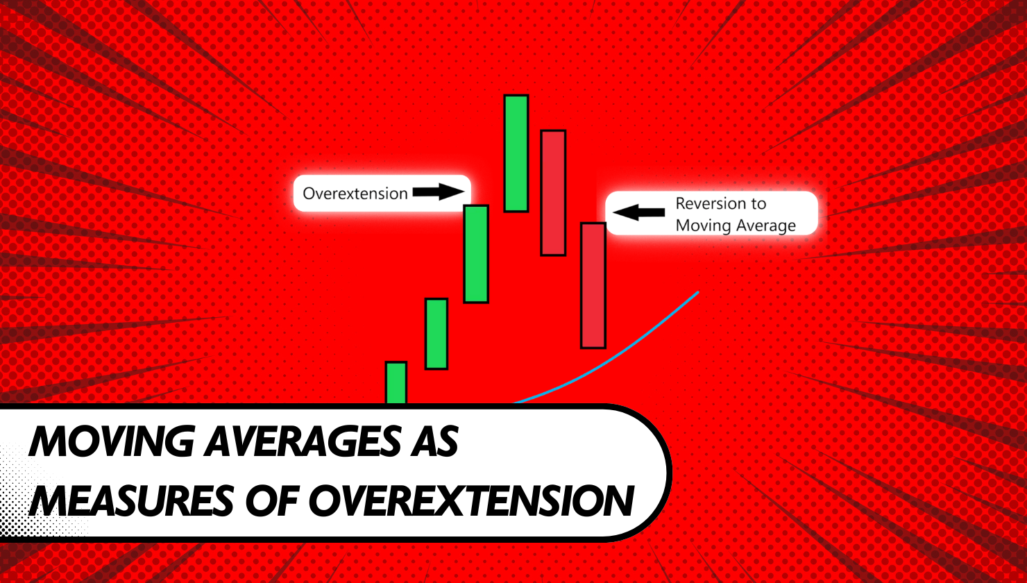
One of the most straightforward ways to assess overextension is by measuring how far price has moved away from a key moving average.
Moving averages represent recent equilibrium. When price deviates significantly from widely watched averages like the 20-day, 50-day, or 200-day, it suggests that price has stretched far beyond where balance recently existed.
Large deviations above an average can signal overbought conditions, while deep moves below can indicate oversold conditions. The further price gets from that reference point, the more meaningful the stretch becomes.
2. Distance Beyond the Bollinger Bands
Bollinger Bands provide another useful lens, particularly during periods of volatility.
Because the bands are plotted using standard deviations around a moving average, price moving meaningfully outside the upper or lower band is a statistical statement. Sustained trading above the upper band suggests upside overextension, while persistent movement below the lower band suggests downside overextension.
This becomes especially important when the bands are already expanding. Being far outside a two-standard-deviation boundary during high volatility is a strong indication that price has moved sharply and potentially unsustainably.
3. Consecutive Up or Down Bars
Sometimes the simplest metrics are the most revealing.
Tracking how many bars a stock has moved consecutively in one direction can expose exhaustion. Multiple directional bars without meaningful pullbacks often reflect emotional or forced participation rather than healthy price discovery.

On daily charts, one or two same-direction days rarely matter much. Even several days in a row can be insignificant if the candles are small or average in size. But when you see three or more consecutive large-range bars in the same direction, that’s when my attention sharpens.
As a side note, this is one of my favorite ways to rank watchlists during extreme volatility events and panic-driven sessions.
4. Distance From Recent Consolidation or Inside Bars
Consolidation zones and inside bars often act as short-term equilibrium points.
When price rapidly departs from these areas, especially without meaningful pauses, it can signal overextension. These zones represent areas where buyers and sellers previously agreed on value, and aggressive departures often invite mean reversion as traders reassess positioning or take profits.
The farther and faster price moves away from these reference points, the more stretched the move becomes.
5. Acceleration in the Slope of Price
Overextension isn’t just about distance — it’s also about speed.
When the slope of a move begins to steepen rapidly relative to its prior trend or historical volatility, it suggests acceleration that may not be sustainable. Gradual steepening often reflects healthy trend development, but sudden sharp acceleration tends to align more with emotional or capitulatory behavior.
This can be evaluated visually or quantified mathematically, depending on how systematic your process is.
6. Acceleration Relative to the Market or Sector
Context matters.
If a stock is accelerating sharply while the broader market or its sector remains relatively flat — particularly in the absence of fresh news — it may be moving too far, too fast. Relative overextension often reveals itself when a stock decouples from its peers without a clear catalyst.
This comparison adds another layer of confirmation and helps avoid analyzing price in isolation.
Putting It All Together
No single metric should ever be used on its own to define overextension. This list isn’t exhaustive, but it covers the essential tools I rely on.
The key is to view all of these factors on a spectrum. When multiple measures begin to align, they paint a clearer picture of where price sits relative to its historical behavior and market norms.
This multi-variable approach leads to better decisions — whether you’re entering a trade, managing an open position, or deciding when to take profits.
For traders who prefer a more structured process, I’ve also turned these concepts into a downloadable checklist that can be used both in real time and during post-trade reviews.
Overextension isn’t a feeling — it’s a conclusion earned through context.
If you’re struggling with trading, you might need to evaluate your strategies for true edge, take the next step HERE.
